In March 1997, the world started to end with a little girl named Meg, and the tree branch that sprouted from her back.
Written by Jeff Lemire Illustrated by Phil Hester With Eric Gapstur and Ryan Cody
A Story About Family
If you’ve read Jeff Lemire’s comics, you know that family and childhood are big sources of inspiration for him. This excellent series debut from Image is no exception. obviously — I mean, it’s called Family Tree.
The dynamics between single mom Loretta, her troubled teenager Josh, and her naive daughter Meg make Family Tree #1 equally entertaining and heartbreaking.
The first issue focuses on Loretta’s worldview and the daily humdrum of her life. Panels showing the inside of her humble home resemble early-2000s episodes of Malcolm and the Middle, a sitcom about a low-income family who are looked down upon by their neighbors. (For the Malcolm in the Middle fans out there, Loretta works at a grocery store, just like Louis. Conspiracy or coincidence?)
Tone and Mood
Loretta narrates the story in a frank, introspective, tone that matches her no-bullshit personality and dry humor. As you flip through the pages, you see her triumph over the people who patronize her, which is, again, just like Louis from Malcolm in the Middle. It is immensely satisfying to see Loretta question her son’s bald principal “What would you know about a strong male presence?” when he implies that her parenting is the reason Josh got caught with weed in his backpack at school. Josh’s absent dad is just one of three big mysteries in Family Tree #1.
This is just one example of how the creators of Family Tree effortlessly foreshadow revelations about family history and the impending doom. Another example of this happens on panel when Loretta makes eye contact with a menacing man at the grocery who clearly isn’t there to buy ingredients for dinner. On the page, he overshadows three panels showing Loretta’s stern reaction to the uncomfortable situation.
Eerie and Economic Art
The dread is palpable on every page, between Loretta’s exasperated facial expressions of the increasingly severe “rash” progressing on her daughter’s arm. The character design and setting are 90s without being cloyingly nostalgic, lending some authenticity to the story. Dull greens, oranges, yellows, and purples reinforce the mood that something dark and sinister — but also strangely beautiful — is unfolding. White spaces within and between panels alleviate some of the emotional heaviness while also bringing important story elements into focus.
When such an intriguing concept is backed by concise writing and genre-defying art, it deserves attention.
Rating
8.7/10
Follow this family drama as it branches out into the mystery and action that Jeff Lemire and his collaborators planted in issue one.
There hasn’t been a shortage of Joker-related content this year. But there’s been a shortage of good films and comics about him. With Jeff Lemire behind the keyboard, “Joker: Killer Smile” is actually worthy of conversation.
I’ve been a fan of Lemire ever since I read A.D. After Death. (Not many people would agree with me on that one.) But to me, Jeff Lemire represents what comics is all about: the marriage of art and literature on the page, distributed to the masses for cheap.
Joker: Killer Smile Is a Beautiful Comic About Beauty
“Joker: Killer Smile” does just that. It’s a beautiful comic about beauty. Literary and artistic, “Killer Smile” hones in on how the Joker sees himself as a performance artist.
When you really think about it, though, the performance artists on display here are Jordie Bellaire (my favorite colorist) and Andrea Sorrentino (the line artist).
Andrea’s line work is substantial. It evokes noir with heavy shadows, extreme closeups, and uneasy camera angles that convey the paranoia of an Alfred Hitchcock movie. There’s no shortage of innovation in their collaboration. Cheekbones and shadows are evoked with color instead of crosshatching. The palette is washed out without being weak.
With plenty of room to breathe, the art carries the weight in this book. It helps that every word in the comic is meant to be there. It’s a relief to see a writer (especially a more experimental one) with the confidence and trust to let the art do the talking.
There are also some nods to Watchmen in “Joker: Killer Smile.” The therapist who brings his work home with him, to the disappointment of his wife. There’s an abundance of Rorschach imagery in the panels. There’s a story within the story, serving the same thematic purpose as “Tales of the Black Freighter” did back in 1986.
There’s Just One Downside to “Joker: Killer Smile”
Like nearly all Joker stories, the plot engine is extremely tired. The I’m A Therapist Who Will Fix Joker trope has been played out — just have your friend tell you about Harleen so you don’t have to spend money on it yourself. Still, this is a really successful interpretation of that premise that feels…different.
“Joker: Killer Smile” is a 9/10. This is a surreal comic that is actually digestible. (No unintelligible Azzarello escapades here.) Better yet, it’s like nothing you’ve ever seen before. Buy this book.
Kitty Pride — I mean Kate — is a badass. After the Central Park gate to Krakoa effectively punches her in the face (see below), she channels her frustration at being unable to portal to Krakoa into something productive. She’ll help those who can’t get to Krakoa get there, even if Kate herself can’t pass through* the gates, for reasons unknown.
(*It’s strange, because Kate can physically be on Krakoa, she just can’t conveniently travel to there through the gates.)
When Emma of the Hellfire Trading Company learns about Kate’s unique predicament, she naturally has a business proposition. After some mind-reading conversations, it’s decided that Kate will captain a massive ship, sail around the world, and liberate mutants who are unable to access the gates. It’s on these pages where the art really shines. Kate looks like a hologram/ghost as she discusses things over with Emma, with colorist Federico Blee responsible for that sucessful effect.
Most of the time, the mutants in this predicament are political prisoners of some kind. This issue focuses on Russian mutants who are under military capture. It takes a nine-page, highly choreographed (and weirdly patriotic) fight sequence to bring them down.
Like all of the books of Hickman’s X-Men universe, this issue is tacitly political. But because it’s a tie-in, the creators are allowed to have more fun with it. And writer Gerry Duggan and artist Matteo Lolli did just that. There’s plenty of banter and scrunched facial expressions to go around.
This series isn’t something I’d continue with, but if you like pirate-style adventures, zany X-Men characters, and watching mutants kick communist butt, then this is just for you. The story is about mutant liberation just as much as it is about Kate’s liberation; that is, becoming her own woman.
In 2019, it’s easy to say that a comic is about fascism, white nationalism, totalitarianism, communism, or whatever brand of worldview has captured the general population’s attention, for better or for worse. For Hickman’s work in “House of X” and “Powers of X,” this was especially true.
After all the buildup in those two prequels, “X-Men” #1 is decidedly not for or against any of those ideologies listed above. It doesn’t even allude to them. Instead, it shows people on two sides of a conflict making the best decisions they can to embrace life and protect the people who they love.
“X-Men” #1 focuses on Scott Summers, who has long been one of the most controversial characters in that world. Although he’s the most classically heroic of the X-Men bunch, he’s also had a lot of negative publicity. Issue #1 is told mostly through Scott’s perspective, meaning that you’re reading everything through rose-colored glasses.
In “X-Men” #1, you see the key moments in Scott’s journey from someone afraid to open his eyes to someone “choosing to spend [his] days focused on the things that make [him] want to live.” In the Summer House, situated on a Krakoan biome located adjacent to the Blue Area of the moon (with a bitching view of planet Earth), Scott, Cyclops, Wolverine, Jean, Vulcan, Havok, Calbe, and Rachel live together in an expansive mansion that also serves as a tactical base for mutants. This communal, family-oriented living situation harkens back to the living situations of immigrant families in America during the early 1900s.
Similarly, you have Director Devo, who controls the orchis Forge, humanity’s great doomsday weapon created to save them from extinction. Like Professor Xavier’s face, Devo’s is covered by a device that enhances his powers. In this case, Devo was born blind, but uses the headgear to see — much like Scott Summers.
Though the similarities mentioned above are mostly visual, they harken to some fundamental truth: both men are searching for a way to save their people. This is only possible if they believe in something bigger than themselves: whether that be the weapon that is a community of mutants, or a giant weapon floating in the sky.
“X-Men” #1 is all about finding the commonality between two opposing sides of a major conflict. It’s about discovering how fear, vulnerability, and hope can unite two very different kinds of people for the exact same reasons. And that’s why “X-Men” #1 one of most brave and potentially controversial comics of the year. You won’t want to miss this.
Written by Marco B. Bucci Art and Colors by Jacopo Camagni Letters by Fabio Amelia (Arancia Studio)
“Nomen Omen” #1 from Image Comics is a supernatural/fantasy/horror comic that is equally disturbing and confusing. Brought to life by a team of Italian creators, there were a few things lost in translation — and it’s not because of language differences. This is a comic that is too smart for its own good.
In typical Italian fashion, “Nomen Omen” #1 opens with a lusty pretext. (My grandmother immigrated to NYC from Sicily, so I am somewhat qualified to call Italians a lusty people.) Two young women hit the road after they were caught bathing in the moonlight, naked (of course). There’s some other confusing details about their families and plans for the future before they discover the car crash that will kickstart the story into motion.
I’m not here to give you a panel-by-panel recap of “Nomen Omen” #1. But I feel that these first four pages — arguably some of the most important pages in the first issue of a series — represent a larger problem of this story: all of the disorientation that Bucci creates makes it hard to invest in the characters and their story.
The story is punctuated with vague incantations talking about some ominous future, which can be exhilarating and leaving you wanting to know more. There’s some very sexual panels, and very violent ones. There is an entire page of poetry, framed inside a glowing moon, which spoke to the nerdy English major within me. If you’re patient enough to parse the verses, you’ll find some foreshadowing that can help you see through the fog in the coming pages.
Fabio Amelia’s letters bring the story to life. He uses variations in font size, word bubble outlines, color of sound effects to give this story an edge. In a double page splash that depicts the inciting incident in the story, his sound effects rhythmically guide your eyes across the page, and give the action a tribal quality with the repeated “tum” drumming sound. When the evil character speaks at the end of the book, his words are coated in black, outlined by a wobbly bubble that gives his speech a guttural, dark quality.
The art from Jacopo Camagni in “Nomen Omen” #1 has a unique interpretation of manga style, and some of the page/panel layouts are spectacular. The latter half of the book is predominantly black and white, with the exception of a bright, beating heart and pink fur in two consecutive pages. Camangi knows how to create a dramatic, disturbing sequence of action that really move the story forward in the direction Bucci is trying to guide it.
My favorite part about his art is all the attention to detail. In one panel inside the protagonist’s home, her photo wall reveals that she won the Google Science Fair and that her parents support the All Genders Matter movement. This quickly conveys characterization, with no dialogue or captions required. For all his attention to detail in bringing the story elements to life, Camangi barely did any crosshatching, which is a classic way to convey dimension in skin and fabrics. The lack of gritty, fine lines makes some panels fall flat, but Camagni’s expertise in using color for lighting/shadow while masterfully illustrating perspective makes up for that shortage.
And then there’s the incorporation of instagram in the story. I often feel that comic books (and the entertainment industry in general) haven’t found impactful ways to integrate technology into the plots of regular stories (in a more casual way than Black Mirror does). An entire page of the comic resembles an instagram feed, and at the bottom it displays the instagram handle @_nomen.omen_. There is no sign of these panels on that instagram page, and I’m perplexed as to how that account relates to the story — aside from the posts of the rainbow birthday cake, which was featured in the comic.
The artistic features of this story are truly something to behold, and if you’re patient enough, I think Bucci’s writing will find its footing in the issues to come.
Written by Stjepan Šejić Illustrated by Stjepan Šejić Colored by Stjepan Šejić Lettered by Gabriela Downie
Harley Quinn’s story began when Dr. Harleen Quinzel was walking home from the bar, after the pitch for her criminal psychology research grant didn’t go as well as planned. She’d run into the Joker on Gotham’s streets that night, and her life would never be the same.
“Harleen” Book #1 of 3 is really Act One of Three in terms of the overall story. And so Šejić very clearly sets up the circumstances surrounding the main character’s situation.
Harleen Quinzel is a young psychiatrist whose research got funded against all odds, so she’s on a mission to prove herself and get people to look beyond her past. Dr. Quinzel hypothesizes that Gotham’s most hardened criminals have lost their ability to feel empathy, and that restoring that ability could be both rehabilitative and preventative.
She needs to prove her theory on criminal psychology and validate that she’s where she is now because she’s earned it. And all of this hinges on her ability to study DC’s laundry list of A-list criminals: most notably The Joker, who is locked up in Arkham after Batman took him down the night Harley was walking home.
Locked away, the Joker needs an audience, and she’s listening. (It’s her job, after all.)
Stjepan Šejić (pretty much) single handedly made “Harleen” DC’s best Black Label book thus far. Sixty pages full of constantly entertaining panels later, I’m thinking about how impressive it is that one guy can so fully understand the fundamentals of art and storytelling.
“Harleen” #1 is a story about a bright young woman with a tendency for self-sabotage. Narrated by her future-self, it’s structured to show Harley’s reflections on Harleen’s downfall.
Šejić cleverly repeats verbal motifs for symbolic effect in “Harleen” #1. For example, Harley thinks about her budding relationship with The Joker as stars aligning. It suggests that some mystical element wedged itself between Dr. Quinzel and her science, pulling her towards her fate.
The writer/artist also uses visual motifs to this end in “Harleen” #1. Harley constantly draws on the symbolism of light and shadows, poetically saying how when you’re walking toward the light you can’t see your own shadow behind you. To represent this visually, Šejić creates a half-page panel where Dr. Quinzel walking toward her bright future as a psychiatrist studying Arkam’s most notorious criminals, but behind her the shadow of Harley Quinn lurks with a gun and mallet in hand.
Because “Harleen” #1 is told in retrospect, there is a lot of tension between the past and present in the art. The moment The Joker and Dr. Quinzel first met, both characters flank the leftmost and rightmost side of two splash pages, eyes locked on each other, The Joker pointing his gun directly at her, with panels in between showing all her major decisions up to that life-altering moment. Šejić uses this structure to comment on how life is just a series of decisions leading up to one moment that might undo all those decisions, good or bad.
In these ways, the genre elements of thrillers, tragedies, and romance stories comes through in the art of “Harleen” #1. From the moment Dr. Quinzel meets The Joker, before she learns that her research was even funded, she is doomed.
It seems that Harleen’s hypothesis about criminals lacking empathy might only be half of the story. As she unravels her future by inevitably growing closer to The Joker in Books 2 and 3, she might discover they are the way they are because of self-destructive tendencies. Only then will she be able to empathize with them herself, instead of merely sympathizing as a researcher.
Book 1 of “Harleen” looks at the full spectrum of humanity, from good intentions to hidden agendas. It’s an empathetic portrait of a young woman dealing with doubting colleagues, unexpected success, and people who want her to fail to prove their own point.
Written by J.J. Abrams and Henry Abrams Art by Sara Pichelli Assisted Inks by Elisabetta D’Amico Colored by Dave Stewart Letters by VC’s Joe Caramagna
From the moment that Marvel teased its big Spider-Man project on Twitter, everyone started paying attention. Turns out that instead of a new Spider-Man movie, we’d be getting something pretty close to that: a Spider-Man comic written by one of the most prolific directors of action, science fiction, and drama films, J.J. Abrams. (Oh yeah, and his 21 year old son, Henry would be cowriting.)
Given his background, you’d think that Abrams would be perfect to write “Spider-Man” #1, given that the genre relies so heavily on the conventions of action, science fiction, and drama genres. You’d be correct.
“Spider-Man” #1 is a coming-of-age story about Peter Parker’s son, Ben — so puberty is bound to factor into that, complicating things even more. The first third of the ‘Bloodline’ story is a flashback, and the last two-thirds of the story are flash forwarded 12 years into the future, to the present day.
Because of this structure, a lot of the characterization in “Spider-Man” #1 happens off-panel — and that is a big part of this story’s mystery. The Parker family dynamics are laid clear across the page with scenes of tense or subtle dialogue, complemented by private character moments, like Ben discovering a box in the attic containing love letters between his parents and photos from his dad’s past.
The new villain, Cadaverous, is somewhat secondary to the story, but I have to care about the characters before I can understand him in contrast. The Abrams duo are introducing him and his plans very carefully in “Spider-Man” #1 ‘Bloodline.’ As they slowly reveal more about Peter’s past, and how Cadaverous factors into that, the art piques your curiosity even more. Every page featuring Cadaverous is dominated by his towering presence and creepy posture. Wherever Cadaverous goes, he is blanketed in an eerie red color palette. Every time he speaks in wobbly, handwritten letters, blanketed in gray balloons, you can hear his calculated depravity.
So even though Cadaverous is mostly a wild card at this point, the artists tell you what you need to know about him.
This creative team works hard to bring comics readership a cinematic story with emotional impact. “Spider-Man” #1 reads like a perfect storyboard. In the scene where we’re introduced to the main character, Pichelli uses overlapping panels to show him quickly getting ready in the morning before school. This reminded me of the fast-paced scene introducing Miles Morales and his family as he was getting ready for school in the movie Spider-Man: Into the Spider-Verse.
The attention to detail in “Spider-Man” #1 ‘Bloodline’ is remarkable. No space is wasted. Sound effects stretch across panels and are even positioned at the top and bottom of panels to add even more movement to the action. Word bubbles overlap when two characters are arguing in the car, adding to the sense of claustrophobia and how they’re talking over each other. The (many) tears in this book are rendered so beautifully that I wanted to cry!
The dialogue, cinematographic panel layouts, and distinct atmosphere created with the art, colors, and lettering make this comic a standout among this week’s releases.
⭐⭐⭐⭐⭐
Rating: 5 out of 5.
With “Spider-Man” #1, J.J. Abrams and his son Henry write the most meticulously paced, emotional, and suspenseful Spider-Man comic I’ve read this year. With the help of Dave Stewart’s neat colors and Joe Caramanga’s innovative lettering, Sara Pichelli’s crisp art moves with such fluidity that this comic might as well be an animated film.
Nine kids have died, and dozens are missing in Archer’s Peak, Wisconsin. With Something is Killing the Children#1, BOOM! Studios brings us the best horror comic I’ve read all year. In every page, the paranoia is palpable, and each character feels a sense of isolation and doubt.
James, the protagonist, finally made the kind of friends you’d have sleepovers with. On the night of one of those sleepovers, they all die in the woods — moments after he tells them a true (?) story about a monster that resembles the thing that killed them. When James describes the events of that night to the police, he reveals that the story he told his friends during Truth or Dare was made up.
He’s also lying to the cops, and says that he didn’t see anything that night. That he only heard the massacre. Writer James Tynion IV has given us an unreliable narrator to convey this horrific story, and I’m skeptical of everything he says — even though I empathize with him.
Part of the reason I have a complex relationship with this protagonist is because of Werther Dell’Edera’s humanizing art, and Miquel Muerto’s consistently immersive colors. The story is interspersed with extreme closeups that convey anguish, confusion, and sorrow. Distinct hatching adds weight to these facial expressions, and creates shadows that support the mood and atmosphere.
Together, these two artists have created a unique interior style that is unlike anything I’ve gazed upon in recent memory. Particularly, they use two consecutive double-page spreads to show every gory detail of what really happened that night in the woods. (I’ll save that experience for when you pick up the book, but here’s a similar spread below.)
Supporting the gestural brushstrokes and muted watercolors of blue, green, purple, and yellow are Andworld Design’s letters. In a scene where one of James’ classmates accuses him of murdering his friends because he’s gay and was experiencing unrequited love, James says “Shut up” in gray letters that are slightly smaller than the others on the page. Further down that page, he screams in frustration, “SHUT THE FUCK UP!” Without this contrast, that raw moment of would have lost its effect.
There was only one flaw I noticed in the whole pilot to this gripping series. Earlier in the book, we learn that James’ three dead friends are named Karl, Robbie, and Noah. At the end of the book, when we see the flashback of the massacre, James calls Robbie Tyler. I reread the issue three times to sort this, and still have no answers. I’m assuming it’s a mistake, but will confirm it as I continue to invest myself in this horror tale.
This isn’t just a horror story, though. It’s an analog for how school shootings have damaged our national conscience, how the news ineffectually covers the epidemic, and how police are ill-equipped to combat the problem.
Throughout the debut issue, Tynion’s dialogue resonates with a nation grappling with the reality that children are killing each other, with more and more frequency, more audacity. Here’s a quote from the comic that sums it up: “…the world makes a lot less sense than it used to. And every day that feeling gets a little worse.”
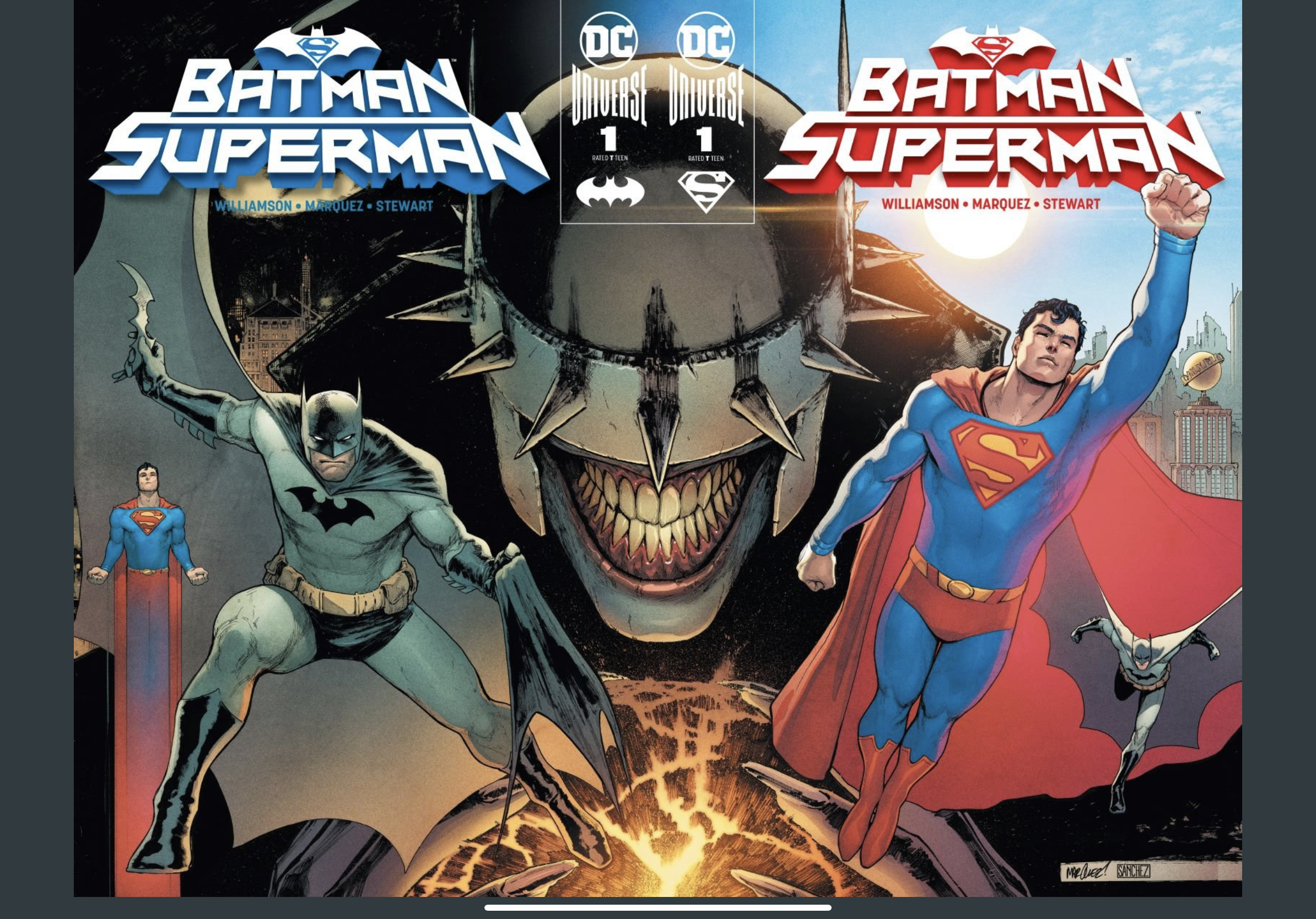
I usually don’t fall head over heels for stories built on the backs of multiverse concepts. And as far as falling head over heels for stories goes, forget about stories that try to milk sales from the sore teat of previously successful concepts — like the whole “Batman Who Laughs” thing.
And yet…here I am, really stoked on Batman/Superman #1. Yes, Superman’s and Batman’s rockin bods and thick necks might have something to do with the allure, but mainly it boils down to great art and great writing.
Joshua Williamson seems uniquely capable of getting inside Superman’s and Batman’s psyches, and David Marquez is easily one of my top four favorite pencilers (ever) in comics. (That list includes Lee Bermejo, Ransom Getty, and Ryan Stegman.)
To my fellow reviewers who feel that Alejandro Sanchez’s colors are “flat” or “dull” or some other negative adjective, to you I say, HOW DARE YOU. The use of light and shadow, the clarity of the hues, the ethereal ghosts in Crime Alley?! Lower your expectations, please, because this dude is a coloring god. (And since I’m name dropping artists not associated with the book, I’ll randomly say that John Rauch is also a coloring god.)
Superman’s opening line — once you get past the whole Jimmy Olsen Does It Again bit — tells you what to expect, straight up. (This was especially helpful for me, A Person Who Did Not Read Batman Who Laughs.)
“From the moment we met, it was clear that Batman and I didn’t see eye to eye. But over time we learned there are some things we always agree on…We would never give in to the devil on our shoulder and hurt our enemies the way they hurt us. If we act like them, we become them.”
Superman
Thinking about how heroes would make the best villains if they decided to become that harkens to the whole With Great Power Comes Great Responsibility Thing, but in a very moody way that is Very DC.
Here’s the nuts and bolts of the whole story: Batman Who Laughs escaped to Earth-0 and wants to use serum on infected batarangs to make DC’s roster of heroes villains. The details don’t really matter. That’s just a Plot Point, and I’m more concerned about Storytelling.
This Whole Situation makes Batman and Superman wonder if the other is infected. Watching Batman ask Superman all these hypothetical questions about what Superman would do if Batman Suddenly Went Bad was…really endearing, like you were watching an odd couple whose love has somehow survived decades and decades and decades. Batman, the cautious planner, Superman, the optimistic live in the moment kinda alien/guy.
All this philosophical musing about the merits of a hero really pops, thanks to colorist Alejandro Sanchez. That scene where the other Superman “dies,” surrounded by the pulpy corpses of his Justice League comrades, is horrifying! My favorite panel: an extreme closeup of Superman mid-“death.” Watery, red eyes. Blood pouring down his chiseled cheekbones. Sweaty hair and shiny lip. Pain. Perfection.
And without David Marquez, where would Sanchez’s colors even be? Showing off his impeccable knowledge of meaty man anatomy, he creates methodical shots that are worthy of a Best Cinematography Oscar. (Why don’t the Eisner’s have a Cinematography Award???) Even the small stuff shines, like the perfectly rendered hands, especially in that one panel of Superman flying to his “death.” The majestic swoops and sweeps of Batman and Superman’s capes, responding to wind and gravity. All that comes together in the two page fight scene against the drones, with the dynamic poses and laser eyes.
Aaaaaand then Shazam Who Laughs shows up? Okay, whatever.
Williamson makes this Year of the Villain cliffhanger resonate with a Batman quote that puts us right where we started. “If heroes ever started to act like our enemies, we’d be better villains than they ever were.”
This comic has tight storytelling, world-class art, and asks a troubling question about being human. Next issue, please.
I’m not really sure about the legality or ethics of this, but here we are. I’m about to break down each individual page of the 60-page epic that Donny Cates and Ryan Stegman bestowed unto us yesterday.
I feel compelled to do this.
On Twitter, a lot of people are asking Cates to justify them having to pay $7.99 for this monumental, triple-sized issue. That’s partly why I wrote this, to show how ridiculous it is to demand that from the creators of a book which gives readers so much.
For those of you who have a digital copy of ABSOLUTE CARNAGE, or were unable to get one because of the ridiculous demand for Marvel’s big event book, know this: it feels satisfyingly weighty in your hands. (Yeah, OKAY, “That’s what she said”…but I’m serious.) This is just one of the many indicators that this book is a heavy hitter, and will have a massive impact on comics for years to come.
1:50 variant cover by Nick Bradshaw
If you haven’t read all of Stegman’s and Cates’ VENOM run, and are also unfamiliar with the million crossovers that give context to this story, don’t worry. Marvel’s blogger minions wrote this helpful primer to prepare you: “As Carnage, Cletus’ new goal is to set free Knull, the God of Symbiotes. All he needs to do is track down anyone who has ever worn a symbiote and steal the latent Knull codex from their bodies.” The thing is, a LOT of A-list characters in the Marvel universe have bonded with a Symbiote.
If you don’t make it past this introduction, there are two things I want you to know about this landmark piece of comics literature: Cates’ words and Stegman’s expressions set up really moving moments that tell you exactly who Eddie Brock is. The other thing? This is the coolest Spider-Man since Todd McFarlane, hands down. (And JP Mayer’s substantial inks are a huge part of that success.)
And there’s actually one last thing I want to tell you. This review? FULL OF SPOILERS. But if you’re picking up a book with Carnage in it, can you really be THAT afraid of anything, especially spoilers…?
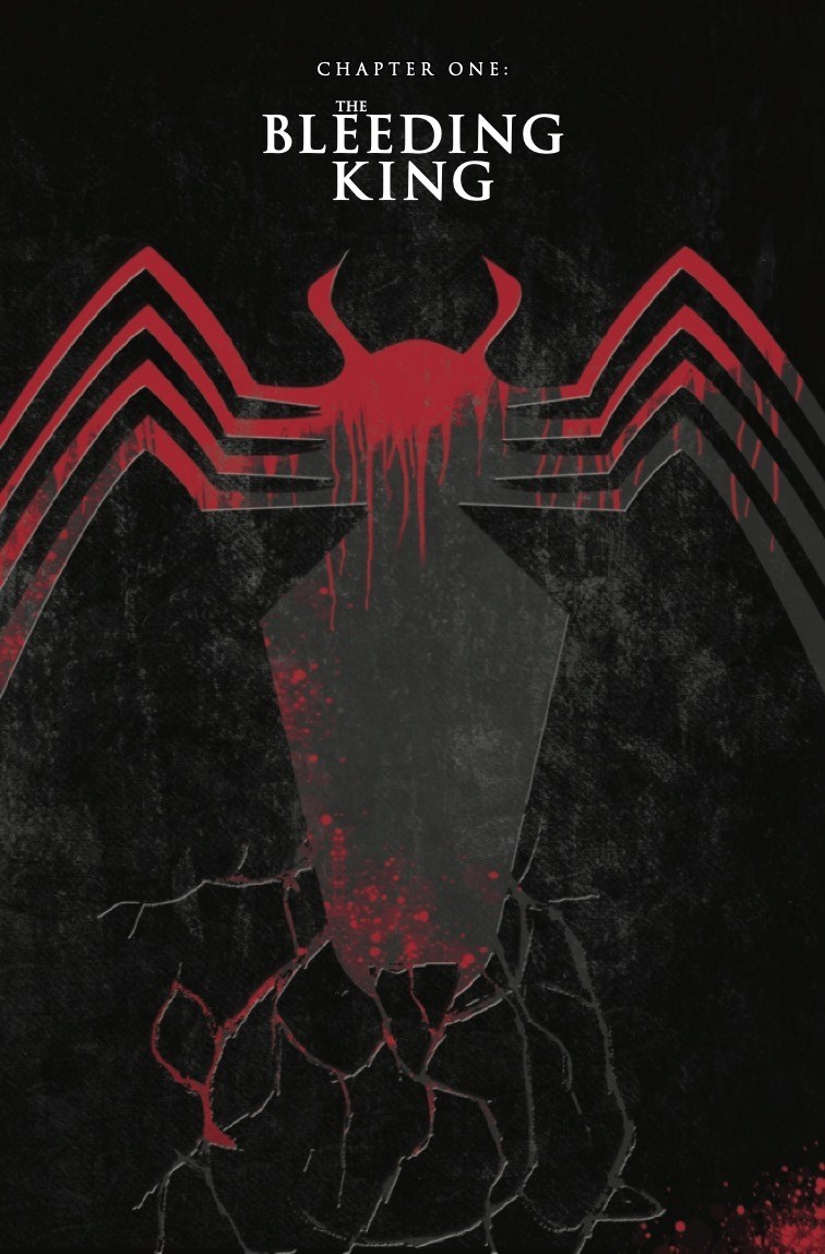
Chapter One “The Bleeding King”
SUMMARY: Carnage is back, and he is on a mission to communicate directly with Knull, the god of darkness, death, and Symbiotes.Eddie Brock is going to need to become Venom, and ask for Spider-Man’s help, if he wants to survive this.
Act One, Chapter 1: Pages 1 – 5
1: Eddie is talking to Dylan, his nine-year-old “half brother”…who is actually his son. This provides a seamless backstory for Knull’s history and plan to doom all things “living and bright.” This is really just Cates talking to his readers, catching them up on what’s happened, and telling them what’s to come. Knull is the god of Symbiotes and ruler of the abyss. Before the beginning of life, he controlled symbiotes with his mind to kill encroaching life — until the symbiotes rose up against him and imprisoned him.
2-3: When symbiotes bond with their host, they leave behind a little piece of themselves in their host’ DNA. This isthe codex. Symbiotes use it to communicate with each other about their host and reconnect to the hive, which is controlled by Knull. Eddie Brock tells Dylan that whomever controls all the codices can talk to Knull.
As we get all this critical backstory, rain falls from the sky as Eddie and Dylan move through the streets of New York. The way Stegman renders rain is better than life. The disorienting downpour creates reflections in the pavement that establish a hazy, ominous atmosphere.
4-5: Cletus Kasady was the world’s most notorious serial killer who rose from the dead to become Carnage. He was resurrected by Church of the New Darkness, a cult that worships Knull. (The cult name is so metal, SO Cates!) With a new purpose, Carnage is trying to collect all these pieces of Symbiotes.
Act Two, Chapter 1: Pages 6 – 13
6-7: Eddie Brock senses that they’re being followed in Times Square. We see a mysterious figure wearing a hat and coat trailing them. As they descend into the subway, we see the faces of miserable New Yorkers getting rained on. (From experience, I can say the way Stegman conveys this is VERY accurate…)
Page 6 of ABSOLUTE CARNAGE, courtesy of a Marvel preview published on AiPT!
8-9: Disguised and hidden in human form as Cletus Kasady, Carnage pushes Eddie and Dylan onto the tracks.
10-11: We discover that Eddie’s Symbiote was actually the one following them. He saves them by smashing into the train, preventing it from running them over. He also derails and crunches a subway car full of people, which doesn’t really help the already terrible public opinion of Eddie Brock.
Stegman’s pencils show the subway train getting derailed by Venom.
12-13: Eddie is now Venom. His “Other” — which is how Eddie refers to his Symbiote — warns him Cletus/Carnage is here.
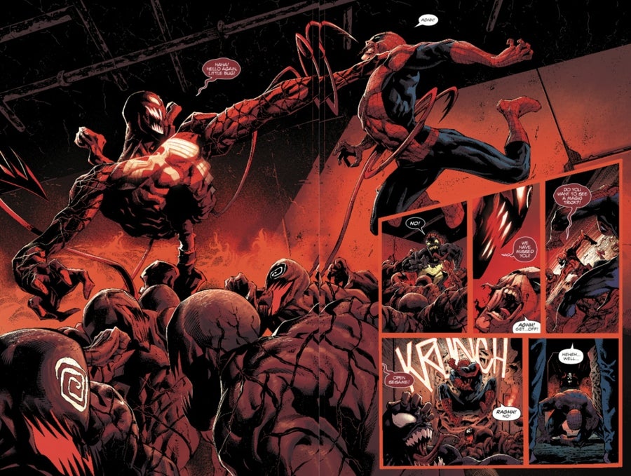
Act Three, Chapter 1: Pages 7 – 22
14-15: The first thing Carnage says to Venom: “WELL HELLO, DADDY!” This reveals that Carnage knows about the real relationship between Eddie and Dylan, and will use this knowledge to make Venom weak. Carnage and Venom battle underground. Eddie’s Symbiote knows that Cletus is wearing the Grendel Symbiote — which belonged to the lethal dragon they fought with Rex.
“WE’RE A GOD NOW!”
– Carnage
16-17: Eddie’s Other seems more self-aware than Eddie himself amid all the chaos. It recognizes that Carnage is too powerful, and that Eddie needs to put Dylan first. As Carnage towers over Eddie, he snarls: “There is no fighting this. This is the end of the light. He is coming! God is —” To shut Carnage up, Eddie grabs the third subway rail — the one charged with electricity.
18-19: In an imaginatively drawn, dynamic splash page shot from bird’s eye view, Eddie shocks Carnage (and himself). We see the hyper-sensitive Symbiotes briefly split from their hosts, becoming wispy, etherial tendrils. Carnage is reduced to nothing more than a splatter of blood and guts — and yet he’s not dead. The electric shock separated Eddie from his Other. The Symbiote now looks like a lost, vulnerable child. It reattaches to Eddie.
20-21: As Dylan and Eddie flee the scene, Venom places Eddie in a brief coma as he heals. The Symbiote autopilots them to their destination so they can ask for help in this crisis. Peter Parker’s roommate answers the door.
22: *clap* COMICS *clap* ARE *clap* BUILT *clap* ON *clap* CLIFFHANGERS. Cates sticks to this golden rule with a full-page reveal of the SEXIEST and MOST JACKED Spider-Man ever. Seriously, ya’ll, this man is the pinnacle of masculinity.
Stegman’s pencils for page 22.
Chapter Two: “The God Son”
Yes, the title sounds metal as hell, but it’s actually a pun (and potentially, some foreshadowing). In this issue, we meet Peter Parker/Spider-Man’s godson, who — like Eddie Brock — has the latent codex inside him.
SUMMARY: Spidey, Eddie, and Dylan meet in a diner to discuss the situation at hand, and how they’ll handle it. They’ll find a potential solution to Eddie’s Carnage/Symbiote problem at the end of the chapter— but is it worth it??
Act One, Chapter 2: Pages 23 – 27
23: As the heroes sit in a diner, casually mulling over the situation, I just couldn’t help but relish in the fact that Spidey is in public wearing his costume, classically deflecting the gravity of the situation with humor.
24-25: There is clearly some awkwardness between Eddie, Spiderman, and Dylan. The boy leaves the table so that Eddie and Spider-Man can speak in private — about Dylan.
26-27: The emotionally intelligent and vulnerable Spidey implores Eddie to tell Dylan the truth about their relationship. He knows a thing or two about growing up without knowing who your father was, which is a hard reality for boys in need of a role model who looks like them.
Just as Spider-Man is at his most persuasive, and Eddie is about to seriously consider telling Dylan the truth, the mission at hand comes back into play. (Of course.) Eddie notices something interesting on the news, and stops listening to Spider-Man. This is a GREAT STORYTELLING AND CHARACTERIZATION MOMENT DONE BY CATES. It underscores how Eddie uses the crisis at hand as an excuse to protect Dylan from knowing about his real identity as Brock’s son.
Act Two, Chapter 2: Pages 28 – 34
28-29: The news broadcast shows a mass grave of bodies piled high, all without spines, found in Jersey. (As if we needed any more evidence that Jersey sucks…) **TAKE NOTE THAT THE BODIES ARE ARRANGED AT THE CENTER OF THE FAMILIAR SYMBOL THAT CARNAGE MADE IN THE EARTH.
30: We learn that the grave is full of people who’ve worn Symbiotes and died. This is a message to Brock from Carnage. As Eddie fights for control of the TV remote so that the cafe manager doesn’t change the channel, we see how unlikable Eddie can be on first impression.
31: This is “A message that says it doesn’t matter if you’re dead. You’re still a target.” As Eddie emphasizes this, Spider-Man’s spider-sense goes off. And let me just lay this on the table: STEGMAN DRAWS THIS BETTER THAN ANY OTHER ARTIST IN SPIDER-MAN’S HISTORY.
32: His spider-sense was triggered by average crooks trying to rob the diner. Compared to the end-times implications of Carnage’s return, this trivial robbery REALLY puts things into perspective.
Ryan Stegman’s iconic pencils for an action panel in Chapter Two of ABSOLUTE CARNAGE
33-34: After Spider-Man squashes these petty thieves in a stylized action sequence from Stegman the pencil god, Eddie seems jealous of Spidey’s relationship to the public, how they cheer for him. The scene changes to Rex Strickland’s safe house. We learn that Maker (a creepy/morally suspect Reed Richards from another dimension) has already created the machine that will extract the Knull codex without killing the hosts.
It seems that Maker and Eddie Brock have an aligned interest.
Act Three, Chapter 2: Pages 35 – 38
35-36: These panels are all the proof you need if you were ever wondering why you see Clayton Cowel‘s name all over your favorite comics. His letters are another important tool of characterization. You can hear how cold and technical Maker speaks by how orderly and stiff the font is when compared to the mildly italicized/all caps bold font of Eddie and Spider-Man.
Spidey’s gestures are another reason why Stegman’s Spider-Man is the coolest thing since Todd Farlane’s innovation with his character design. Preserving the thick musculature and expressive eyes of McFarlane’s Spider-Man, Stegman evolves the character design with a more flexible body, agile musculature, beefy neck, strong jaw, and attention to detail — you can see the outline of Peter Parker’s ears protruding from the mask. No one gets anatomy quite like Stegman these days.
37-38: The involvement of Parker’s godson and Eddie’s son, Dylan, connect the story to a younger audience, the next generation of comics-makers. This is a huge reason behind Marvel’s success. They don’t make any mature content — like DC with their Black Label (formerly Vertigo) — because their content effortlessly engages all ages. Younger readers are generally pulled in by the humor, imagination, and simple morality of the story while older readers are attracted to the intricate plots, choreographed violence, character wisdom, and tone/symbolism of the story.
Now that we’re done with that tangent on why Marvel consistently holds the dominant market share in the comics world, the Maker offers for Eddie to test the machine. This is a win-win-win, for Maker, Spidey’s godson , and Eddie.
Chapter Three “The Long Red Dark”
Summary: Spider-Man and Venom head to the Ravencroft Institute for the Criminally Insane to free “Red Goblin” Norman Osborn before Carnage can get to him first and taps into his codex.
Act One, Chapter 3: Pages 39 – 45
39: Norman Osborn sings a chilling song about squashing a spider that shows the state of his mental derangement. Stegman’s consistently moody rain continues to set the tone in an eerie establishing shot of the institute.
40-41: Bloody carnage drips down the pages, framing each panel. At the bottom of the page, we see the bloodshot, criminally insane eyes of Norman Osborn. Frank Martin’s colors really sell the intensity behind those eyes, as they bulge from Norman’s twisted visage. He also executes believable lighting in an upshot of the guard, John Jameson, discovering Spider-Man and Venom sneaking on the wall.
Stegman’s pencils for the best panel on page 41.
42-43: It’s established — for those who don’t know — that John also has powers as a werewolf. As they’re talking to each other about how to sedate Osborn before opening his containment cell, John is suddenly taken over by Carnage.
The final panel on page 43 is easily the most disturbing panel in the entire comic. It conveys the pain that Carnage can inflict on others. It shows how Cates has mastered the vocabulary of insane people — and shows how deep the author can go into the minds of his characters.
Act Two, Chapter 3: Pages 44 – 48
44-45: As Carnage enters, the color of the panels becomes decidedly evil, reds and blacks dominating the pages, Symbiote tendrils oozing from John’s eyes. Completely devoid of control over his own body, John shoots Osborn’s cell, triggering the alarm. “God is coming.” Venom is hypersensitive to loud sounds, and is briefly incapacitated.
46: Leaking his Symbiote into the prison cells, Carnage adds to his army. These Symbiote hosts break free form their prison cells and march behind Carnage.
47-48: Eddie fires John’s gun at the alarms to stop the noise. This is the most innovative display of motion I’ve ever seen in comics. With the gun in the foreground, we see the speed-lines, kickback, and smoke. Spider-Man webs John so they can prepare to meet Carnage.
Act Two, Chapter 3: Pages 49 – 60
49-50: This all-consuming double-page splash of Carnage and his converts charging toward Spider-Man and Venom would make the perfect T-shirt print. Hear that, Marvel? Yet another opportunity to make money!
51: It’s pretty clear that Carnage is here for Osborn’s codex, always watching and waiting to strike at the right time. Spider-Man and Venom must try to save Norman Osborn from being entirely consumed by Carnage. Spider-Man establishes the mood perfectly when he says, “UGH…” in the final moments before Carnage.
52-53: This is another important characterization moment for Venom. Eddie defines his relationship with the Symbiote and their long, complicated journey. His alien Other gives him pain, and pain is important part of growth.
54-55: As they battle Carnage and his army, Carnage grabs Spider-Man by his throat one of the most compellingly illustrated double-page panels in the history of comics.
Stegman’s original art for ABSOLUTE CARNAGE is being sold, and you better believe this will go for a lot of money.
56-57: Spider-Man and Venom need to break Venom out from his cell, while simultaneously holding back Carnage and his army of obedient Symbiotes. Venom poignantly says, “Don’t be clever, be strong!”
58-59: The layout of panels for page 58 is yet another demonstration of how expansive Stegman’s imagination is. Spiderman’s fist repeatedly hits into the steel door with blazing speed, as we get frontal perspective of him and Venom fighting to get the hell out of Ravencroft. Venom can’t hold the door much longer, and we see Carnage about to devour Norman Osborne.
60: At last, Carnage claims Osborn. Cates closes out this legendary issue with a playful, yet haunting quote from Carnage: “I came here to make friends“.
Norman is Carnage’s puppet.
Anyone who Carnage controls is his puppet, and it will be a terrifying journey to see how he abuses that power in the issues to come.


![Joker: Killer Smile Actually Does Joker Right [Review]](https://secretsocietycomics.home.blog/wp-content/uploads/2019/10/killersmilecovera.jpg?w=825&h=510&crop=1)

![[Review]: “Marauders” Is a Fun Story of Liberation](https://secretsocietycomics.home.blog/wp-content/uploads/2019/10/marauders.jpg?w=825&h=510&crop=1)

![[Review]: X-Men #1 — Humankind and Mutantkind Aren’t so Different](https://secretsocietycomics.home.blog/wp-content/uploads/2019/10/x-men-cover.jpg?w=825&h=510&crop=1)