Review – Batman/Superman #1: The Next Laugh

I usually don’t fall head over heels for stories built on the backs of multiverse concepts. And as far as falling head over heels for stories goes, forget about stories that try to milk sales from the sore teat of previously successful concepts — like the whole “Batman Who Laughs” thing.

And yet…here I am, really stoked on Batman/Superman #1. Yes, Superman’s and Batman’s rockin bods and thick necks might have something to do with the allure, but mainly it boils down to great art and great writing.

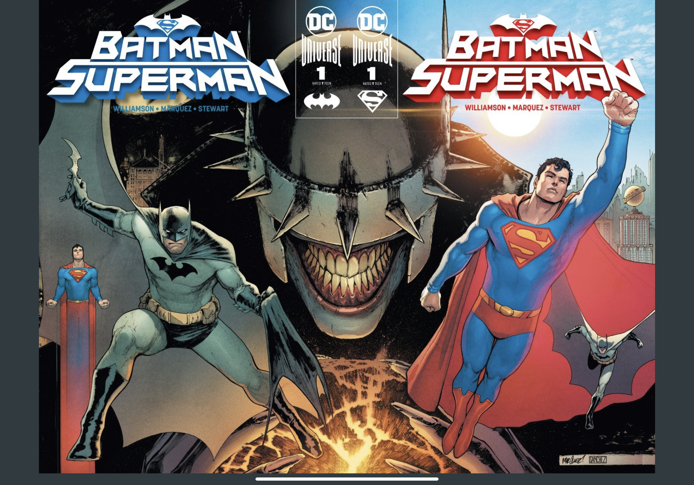
Joshua Williamson seems uniquely capable of getting inside Superman’s and Batman’s psyches, and David Marquez is easily one of my top four favorite pencilers (ever) in comics. (That list includes Lee Bermejo, Ransom Getty, and Ryan Stegman.)

To my fellow reviewers who feel that Alejandro Sanchez’s colors are “flat” or “dull” or some other negative adjective, to you I say, HOW DARE YOU. The use of light and shadow, the clarity of the hues, the ethereal ghosts in Crime Alley?! Lower your expectations, please, because this dude is a coloring god. (And since I’m name dropping artists not associated with the book, I’ll randomly say that John Rauch is also a coloring god.)

Superman’s opening line — once you get past the whole Jimmy Olsen Does It Again bit — tells you what to expect, straight up. (This was especially helpful for me, A Person Who Did Not Read Batman Who Laughs.)

“From the moment we met, it was clear that Batman and I didn’t see eye to eye. But over time we learned there are some things we always agree on…We would never give in to the devil on our shoulder and hurt our enemies the way they hurt us. If we act like them, we become them.”

Superman

Thinking about how heroes would make the best villains if they decided to become that harkens to the whole With Great Power Comes Great Responsibility Thing, but in a very moody way that is Very DC.

Here’s the nuts and bolts of the whole story: Batman Who Laughs escaped to Earth-0 and wants to use serum on infected batarangs to make DC’s roster of heroes villains. The details don’t really matter. That’s just a Plot Point, and I’m more concerned about Storytelling.

This Whole Situation makes Batman and Superman wonder if the other is infected. Watching Batman ask Superman all these hypothetical questions about what Superman would do if Batman Suddenly Went Bad was…really endearing, like you were watching an odd couple whose love has somehow survived decades and decades and decades. Batman, the cautious planner, Superman, the optimistic live in the moment kinda alien/guy.

All this philosophical musing about the merits of a hero really pops, thanks to colorist Alejandro Sanchez. That scene where the other Superman “dies,” surrounded by the pulpy corpses of his Justice League comrades, is horrifying! My favorite panel: an extreme closeup of Superman mid-“death.” Watery, red eyes. Blood pouring down his chiseled cheekbones. Sweaty hair and shiny lip. Pain. Perfection.

And without David Marquez, where would Sanchez’s colors even be? Showing off his impeccable knowledge of meaty man anatomy, he creates methodical shots that are worthy of a Best Cinematography Oscar. (Why don’t the Eisner’s have a Cinematography Award???) Even the small stuff shines, like the perfectly rendered hands, especially in that one panel of Superman flying to his “death.” The majestic swoops and sweeps of Batman and Superman’s capes, responding to wind and gravity. All that comes together in the two page fight scene against the drones, with the dynamic poses and laser eyes.

Aaaaaand then Shazam Who Laughs shows up? Okay, whatever.

Williamson makes this Year of the Villain cliffhanger resonate with a Batman quote that puts us right where we started. “If heroes ever started to act like our enemies, we’d be better villains than they ever were.”

This comic has tight storytelling, world-class art, and asks a troubling question about being human. Next issue, please.

Review: Superman’s Pal Jimmy Olsen #1

Who would’ve thought that a Golden Age character would become the poster-boy for “pivot to video”? Well, in Matt Fraction and Steve Lieber’s newest maxi-series, anything’s possible. Superman’s Pal Jimmy Olsen #1 is a hilarious collection of four related short stories provide a “bizarre tour of the underbelly of the DC Universe.”

The series opens with a family history of the Luthor and Olsen families, focusing on their role in shaping Metropolis. In a hilarious death sequence, Jimmy’s “great-great-grand-something” falls to his death after getting whacked with a shovel while disputing over the land that would be Metropolis. After this brief history, we see a standard day in the life for Jimmy Olsen: falling from outer space with nothing to break his fall…while metamorphosing into a giant turtle, thanks to a biomedical experiment. Though Superman tries to save his life and prevent major damage to Metropolis, he shatters The Monarch of Metropolis — a massive lion monument/tourist attraction erected by the Luthor family.

These shenanigans are fun, but the story really hits its stride in the second half. Jimmy’s space turtle fiasco costs the city and the Daily Planet, but the video of his fall is the only thing bringing money in for the publication. He’s too much of a liability for Metropolis, but he’s good for business, so Daily Planet’s publisher relocates him to Gotham. After moving in to his crappy new digs, it’s revealed that the Daily Planet published a front-page fake news story about Jimmy Olsen getting murdered!

For me, this was a comical story about the “long, slow death spiral” of print media, as the comic puts it. The “pivot to video” and clickbait trends are central themes to this story filled with wacky plot points. Fraction uses puns, witty wordplay, and slick sarcasm in a measured way that complements the strange subject matter. Steve Lieber’s art is just cartoony enough to match the funny script, and the colors heighten the Golden Age nostalgia while remaining crisp.

Credit: DC Comics

Rating 9/10

I need to learn more about the DC Universe, and this comic seems like an amusing tour de force. As a writer, I’m delighted to see comic creators working in a print-based medium address the challenges of the twentieth century. Although comics have adapted to the digital medium (with Comixology), the silver screen (MCU movies), and smaller screens (YouTube reviewers), it’s nice to see a traditionally print-based medium address its own reckoning in such a lighthearted way.

Superman: Year One is the Comic that Nobody Needed, Especially in 2019

If you’re going to judge a book by its cover, then comic books are perfect for that. The covers for Superman: Year One #1 are pretty uninspiring. So is the book itself. But it’s more than uninspiring. It’s cruel.

Frank Miller and John Romita Jr. team up for a modern-day retelling of Superman’s origins — except there’s nothing modern about it. Let’s get the stale plot out of the way so that we can talk about the stagnant idea behind it, the cancerous stereotypes, and the dusty tropes.

Krypton blows up. In a rocket made by his father, Kal catapults through the galaxy. He crashes into earth, where he meets his parochial parents and becomes Clark Kent. Immersed in Miller’s version of Americana, Clark grows up, fights off some bullies, saves his crush from a gang-rape (more on this disastrous scene in a bit), plays some football, gets laid, and then enlists in the Navy.

Father-son “wisdom” at the expense of women everywhere. Classic!

As you can see, the plot isn’t innovative or remarkable. But it does make you see Superman in a new light. That light isn’t flattering.

Clark doesn’t have any interiority here. If he does, all we get is his sense of superiority and frustration. Sure, Clark’s a teenager, but his thoughts reek of Miller’s own prejudices and teenage hangups — from sexist comments, creepy innuendos, obnoxious bravado, to stubbornness that’s nothing more than stupid.

Before the bullies escalate their crimes against innocent podunk Kansas to rape, they’re doing the classic bully stuff that has been portrayed in American film and TV for decades. Amid this yawn-inducing buildup, Clark says, “This is madness. Madness. Why?” It’s because they’re bullies, Clark. This is as deep as Clark Kent gets in Miller’s hellscape.

The bullies achieve obligatory villain status when they attempt to gang-rape Clark’s crush, Lana. She’s on the dirt, crying, with some hands holding her down, others touching her where she’s vulnerable. Clark saves her before the violence escalates, commenting on how feeble human beings are all the while. He then whisks Lana up into the clouds before dropping her at home and asking “Let me court you, Lana Lang” with no regard for what she just endured, no curiosity, no compassion, no sorrow, no anger. It’s incel savior mentality at its worst.

Clearly, the intent and ideas behind Miller’s writing are lacking. So is his style. The voice of the narrator drunkenly wobbles between Miller and Clark Kent. There’s a matronly-looking teacher who says “dumplings,” “my blossoms,” and “angels” within four fucking panels. There’s establishing narrative captions, like “Back home. Supper time” that are entirely pointless because we can see that Clark is indeed at home eating food.

The worst and most prominent lack of style is the unnecessarily bolded font. In the very next panel after the rape scene, here’s what Frank Miller has to offer the people who paid eight dollars to read this: “Boning up there, Mr. Kent?” (Lana) “Damn if Lana doesn’t just have a way of saying things…” (Clark). Excuse me while I go hibernate in a nuclear winter.

An unoriginal sex pun. Nice!

Comics are collaborative, so Miller can’t fully bear the weight of this book’s crushing failure — with the exception of letterer John Workman and colorist Alex Sinclair. Workman excels at making Miller’s gratuitous dialogue highly legible, neat, and crisp. Alex Sinclair imbues finer textures, like prairie grass and hair, with colors that feel natural and bright. John Romita Jr. may have sprung from the loins of a legend, but apparently it takes more than that to draw children’s heads proportionally. Many times, Clark Kent looked like a bobblehead. Danny Miki’s crosshatching is too clumsy and spaced out, while his line weight is unbearably light and heavy. Then again, no inker could salvage Romita Jr.’s creepy take on the human form.

The first installment of this new Superman series was the perfect opportunity for Miller to explore Clark Kent’s boyish charm in a complex, characteristically dark way for the author. Instead, we all can see how immature Frank Miller really is. There’s nothing charming about it. While this Black Label retelling of Superman’s origin is supposed to deviate from the world’s first superhero who we know and love, it’s nothing more than a perversion.

Rating 3/10